
Skip Nav Destination
Close Modal
1-20 of 334689
Follow your search
Access your saved searches in your account
Would you like to receive an alert when new items match your search?
1
Journal Articles
Next-Generation JAK Inhibitors in the Treatment of Myeloproliferative Neoplasms
Available to Purchase
Journal:
Blood
Blood blood.2025028645.
Published: 2026
Journal Articles
Gastrin for the treatment of acute graft-versus-host disease of the stomach
Available to Purchase
Journal:
Blood
Blood blood.2025031080.
Published: 2026
Includes: Supplemental data
Journal Articles
Journal Articles
Journal Articles
Acute promyelocytic leukemia diagnosed on soft tissue biopsy: a rare extramedullary presentation
Free
Journal:
Blood
Blood (2026) 147 (2): 215.
Published: 2026
Journal Articles
Journal Articles
Journal Articles
Journal Articles
The treatment of marginal zone lymphoma
Available to Purchase
Journal:
Blood
Blood (2026) 147 (2): 115–126.
Published: 2026
Journal Articles
Journal Articles
Drug development in MZL: caring for the forgotten child
Available to Purchase
Clinical Trials & Observations
Journal:
Blood
Blood (2026) 147 (2): 127–137.
Published: 2026
Journal Articles
Telomere content and genomics of myeloid neoplasia by whole-genome sequencing
Available to Purchase
Journal:
Blood
Blood (2026) 147 (2): 197–208.
Published: 2026
Includes: Supplemental data
Journal Articles
Clinical Trials & Observations
Journal:
Blood
Blood (2026) 147 (2): 138–163.
Published: 2026
Includes: Supplemental data
Journal Articles
The biology of marginal zone lymphoma subtypes: challenge and relevance of classification
Available to Purchase
Journal:
Blood
Blood (2026) 147 (2): 105–114.
Published: 2026
Includes: Supplemental data
Journal Articles
A Notch trans- activation to cis -inhibition switch underlies hematopoietic stem cell aging
Available to Purchase
Journal:
Blood
Blood (2026) 147 (2): 164–179.
Published: 2026
Includes: Multimedia, Supplemental data
Journal Articles
High-grade/large B-cell lymphoma-11q has a very good prognosis in children and young people without a predisposition
Available to Purchase
Clinical Trials & Observations
Journal:
Blood
Blood (2026) 147 (2): 209–214.
Published: 2026
Includes: Supplemental data
Published: 2026
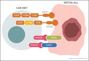
CAR-mediated and NKG2D-dependent targeting of KMT2Ar leukemia by bispecific CAR-iNKT cells. More about this image found in CAR-mediated and NKG2D-dependent targeting of KMT2Ar leukemia by bispecific...
Published: 2026
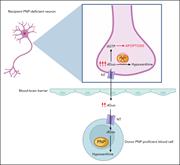
“Cross-correction” of PNP deficiency in neuronal cells after allogeneic HCT. In the recipient’s PNP-deficient neurons, the absence of functional PNP enzyme prevents the phosphorolysis of substrates such as deoxyguanosine (dGuo) into hypoxanthine, leading to accumulation of dGTP. This disrupts the ce... More about this image found in “Cross-correction” of PNP deficiency in neuronal cells after allogeneic HCT...
Published: 2026
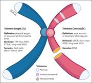
Overview of contributors to TC. TL reflects the physical length of telomeric DNA repeats at the natural ends of chromosomes, which can be measured using methods such as TRF, flow-FISH, STELA, and long-read WGS. TC measures the total amount of telomeric DNA repeats and may include sources such as int... More about this image found in Overview of contributors to TC. TL reflects the physical length of telomeri...
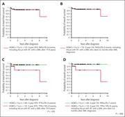
Outcome measures of the 72 patients with HGBCL-11q that were studied. (A) ...
Available to Purchase
in High-grade/large B-cell lymphoma-11q has a very good prognosis in children and young people without a predisposition
> Blood
Published: 2026
Figure 1. Outcome measures of the 72 patients with HGBCL-11q that were studied. (A) EFS and (B) OS of the 72 patients with HGBCL-11q. (C) EFS and (D) OS of the 60 patients with HGBCL-11q without a preexisting disorder compared with those of the 12 patients with HGBCL-11q with a preexisting disor... More about this image found in Outcome measures of the 72 patients with HGBCL-11q that were studied. (A) ...
1
